Visualizing Single-Cell RNA-Seq Data with t-SNE: Researcher Interview with Dmitry Kobak and Philipp Berens
, by Peggy I. Wang
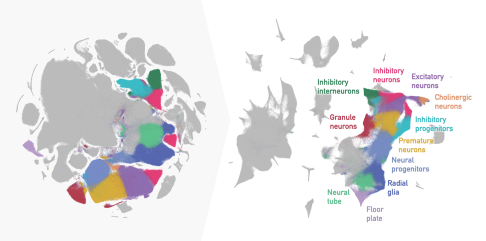
t-SNE embedding of 2 million mouse embryo cells with default parameters from the original publication (left) versus recommended parameters for preserving cell lineage relationships (right), with neuronal development clusters highlighted.
Credit: Adapted from Kobak and Berens, Nat Commun. Nov 2019 doi:10.1038/s41467-019-13056-x CC BY 4.0 and data, colors and annotation from Cao et al., Nature, Feb 2019 doi:10.1038/s41586-019-0969-x
Single-cell transcriptomics can help to untangle the complexities of cancer, from how the disease develops to how a particular tumor responds to or resists treatment.
For example, researchers are starting to deconvolve the tumor microenvironment in terms of both cell type and their active transcriptional programs—an unprecedented level of detail for many cancers that may provide therapeutic insights.
With this widely used, perhaps even now commonplace method, it has become relatively easy to produce single-cell data sets. However, the prospect of analyzing transcripts from hundreds of thousands (or even millions) of individual cells might still be overwhelming.
A logical first step in analyzing single-cell RNA-sequencing (scRNA-seq) data is visualization, and a popular method for this is t-distributed stochastic neighbor embedding (t-SNE).
In “The art of using t-SNE for single-cell transcriptomics,” published in Nature Communications, Dmitry Kobak, Ph.D. and Philipp Berens, Ph.D. perform an in-depth exploration of t-SNE for scRNA-seq data. They come up with a set of guidelines for using t-SNE and describe some of the advantages and disadvantages of the algorithm. The researchers are from the Institute for Ophthalmic Research at the University of Tübingen, and Dr. Berens is a professor of Data Science for Vision Research.
Peggy I. Wang: As researchers at the Institute for Ophthalmic Research, what’s the link that brings you to visualization for RNA-seq data?
Philipp Berens: Single-cell RNA-seq holds tremendous potential for many fields, including basic retinal research and research into mechanisms of eye diseases. For example, it allows linking cell types between the mouse, the primate, and the human, and even organoids, identifying potential target sites for new drug developments.
We’ve focused a lot on data visualizations and machine learning techniques, including applying many of our tools to understand the mouse cortex. We also have exciting collaborations right now applying our RNA-seq tools to ophthalmic data.
PIW: What is it about single-cell RNA-seq data that requires a new visualization method?
Dmitry Kobak: There is probably a new method for visualizing single-cell transcriptomic data appearing every month, sometimes several! There are several reasons for this, I think:
First, scRNA-seq data is just awesome to visualize, with a wealth of biological information reflected in the way the cells are arranged in the so-called embedding, most often a two-dimensional (2D) scatter plot.
For example, there can be dozens of different cell types within one tissue, all appearing as distinct islands in the scatter plot. Islands can cluster together to form archipelagoes, reflecting related but distinct cell types and subtypes. Or they can form connected structures, reflecting continuous biological features, like cells transitioning between stem cell stages. The data can form a tree-like structure that on the 2D plot often ends up looking like an octopus!
Second, single-cell datasets are often collected with an exploratory goal in mind: taking a biological tissue apart into its constituent parts—single cells—and describing what cells are there, how they look and work. This makes unsupervised statistical methods very popular: people want to lay out their data in two or three dimensions, find interesting patterns, and find some way to make sense of those patterns.
Third, there is no perfect method, at least not yet! Some visualization methods can deal with clustered data really well but tend to obscure developmental trajectories. Some can capture continuous structures but tend to clump multiple clusters together. Some are computationally expensive and cannot deal with millions of cells. Also, with amazing progress in experimental techniques, new datasets present new challenges. A visualization method that worked well a few years ago might be now pushed to its limits, and new tools are needed.
PIW: Is t-SNE a new thing? Or repurposed from something else?
DK: t-SNE was developed in 2008 as an extension of an earlier algorithm called simply, ‘SNE’. In retrospect, I think the original SNE paper was really transformative, more so than was appreciated at the time. It initiated this new genre of dimensionality reduction methods based on preserving neighborhood relationships (SNE stands for “stochastic neighbor embedding”).
It wasn’t until around 2013 that the first efficient implementation of t-SNE was developed and the first major application of t-SNE to a single-cell data set was published. I’d say this gradually led to the t-SNE boom we’ve been seeing since then.
PIW: Without getting too technical, how does t-SNE work?
DK: The main idea behind SNE is very simple: the algorithm first finds similar data points, or “close neighbors”, in the original data set (in this case, cells with tens of thousands of gene expression measurements each). Then it tries to arrange the points in a 2D plot such that those close neighbors remain close and distant points remain distant.
This idea was revolutionary because popular methods of the past focus on preserving large distances; the points that are far away in the original data should have similarly large distances in the 2D embedding. This is true of principal component analysis (PCA) and multidimensional scaling (MDS), the previous visualization methods of choice.
It turns out that preserving large distances does not work very well for transcriptomic data! Distances calculated from the original data behave very differently from distances in 2D spaces, and there just is no way to arrange the points in 2D such that they faithfully preserve the actual distances.
The SNE/t-SNE approach effectively says, “We give up! We will not even try to preserve numeric distances!” Instead, it only preserves whether the points are “near” or “far”, in some sense. This is how all other modern and effective visualization algorithms work, including largeVis and UMAP.
Let’s consider, for example, scRNA-seq data from the mouse cortex. Neurons of the same category, let's say fast-spiking interneurons, should have similar gene expression and be designated as “close” neighbors. t-SNE will try to position the fast-spiking interneurons so they do not overlap with other cell types, such as non-neural astrocytes.
PIW: So the final output of the algorithm is groups of cells with the original distances between the cells essentially forgotten. How does the algorithm achieve this output?
DK: t-SNE places the points in some initial configuration and allows them to interact as if they are physical particles. There are two “physical laws” of this interaction: 1) each pair of close neighbors attracts each other and 2) all other points repulse each other.
When I teach this process, I like to show the animation of how this happens. Close neighbors feel the attractive forces and gather together. Distant points are repulsed from each other and drift apart. This process runs for some time until the movement settles and the arrangement does not change anymore.
PIW: Can you explain the concept of local and global structure, which is discussed quite a bit in the paper?
DK: The idea of “structure” in dimensionality reduction actually lends itself quite well to cellular or organ structures in biology. Continuing with the example of the mouse cortex, fast-spiking interneurons may actually consist of several subtypes, and one would want to see these subtypes as individual clusters in the 2D plot. This is “local” structure.
But all inhibitory neurons and all excitatory neurons together are much more similar to each other than to non-neural cells, such as astrocytes or microglia. This is “global” structure.
t-SNE excels at finding local structure and showing specialized cell types as isolated islands. But it easily fails at representing the global structure: imagine that all these isolated islands are shuffled around and randomly arranged on the 2D space, such that an astrocyte island ends up in between two interneuron islands. This is what t-SNE will typically do.
PIW: What are the main dos and don’ts you’ve uncovered for using t-SNE?
DK: Initialization is one thing that we’ve found to be very important. As I mentioned, t-SNE positions the points in 2D in some initial configuration and then moves them around in small steps. The global arrangement of islands mostly depends on the initial configuration. Standard implementations use random initial configuration, leading to random arrangement of islands—and different results every time you run it.
We suggest using something called informative initialization, where rather than randomly placing points at the start, we use principal components or other prior knowledge about the cells’ relationships to help decide where points should start out. This often does the trick of preserving much more of the global structure and also produces a deterministic output.
Optimization parameters, such as the learning rate, can also have dramatic effects. We provide clear guidelines on how to set these parameters in our paper. The importance of learning rate was established in another paper published back-to-back with ours.
We also advise using something called “exaggeration” when embedding very large datasets (with hundreds of thousands or millions of points). Exaggeration makes the clusters tighter and increases the amount of white space, making visualizations easier to interpret. Interestingly, the mathematical reason behind why it works so well is not entirely clear; this is one of the things we are currently working on.
PIW: Is t-SNE the clear winner for single-cell RNA-seq visualization? How does it compare with the other modern visualization methods?
DK: UMAP appeared in 2018 and has become hugely popular in the single-cell community, perhaps even more so than t-SNE. I think it has big potential, plus a very convenient and effective implementation.
As I previously mentioned, UMAP falls firmly within the same framework of embedding nearest neighbors. The equations for attraction are actually very similar to t-SNE but the equations for repulsion are different, making the internal implementation for UMAP very different.
On the surface, the main difference is that UMAP has stronger attractive forces, roughly corresponding to the t-SNE exaggeration factor of ~4. Our group has been working on why it works out like this and figuring out the relationships between attractive and repulsive forces.
In our testing, we found that if following our guidelines, UMAP and t-SNE perform similarly. I think a lot of work still needs to be done to flesh out the trade-offs between the two methods.
PIW: Is t-SNE easy to use? How does accessibility compare with UMAP?

Dr. Dmitry Kobak, postdoctoral researcher at the Institute for Ophthalmic Research at the University of Tübingen.
DK: The fastest t-SNE implementation is called FIt-SNE. It is implemented in C++ and has wrappers for Python, R, and Matlab, making it very easy to use. There is also a pure Python re-implementation called openTSNE that is more flexible. Both are relatively easy to install (also true of UMAP).
Overall, the runtime for 2D embedding with t-SNE and UMAP are roughly comparable. For very large datasets (with millions of cells), FIt-SNE tends to run somewhat faster than UMAP. For 3D or higher-dimensional embeddings, UMAP is currently much faster.
PIW: Does t-SNE not scale for large data sets? What are the modifications to make it work?
DK: Until FIt-SNE appeared in 2017, it was a challenge to run t-SNE on any dataset with hundreds of thousands of points. Now I can embed a dataset with a million points in half an hour on my laptop, and in around 10 minutes on a powerful lab computer.
Another challenge is that large data sets tend to emphasize t-SNE’s weakness with capturing global structure. The archipelagoes and tree-like structures we described can get scrambled or distorted.
In our paper we suggest some ways to mitigate these problems with parameter settings and initialization techniques, but I see this only as a first step. These are heuristics for running t-SNE more effectively, and there is still a lot of room to develop new methods that could better preserve global and local structure. I am sure we will see more interesting developments in the next few years.
PIW: For someone with less statistics background, how do you know if you’ve done a good job using t-SNE or if you’ve just adjusted the parameters until you see what you want?
Dr. Philipp Berens, Professor of Data Science for Vision Research at the Institute for Ophthalmic Research, University of Tübingen.
DK: This question touches on an important problem: how to quantify whether a given 2D plot is faithful to the original data. I can easily imagine somebody running 10 different visualization algorithms with 10 different parameter settings on one dataset, getting 100 different embeddings and struggling to choose the “best” one. As you suggested, this could lead to cherry-picking.
Unfortunately, quantifying the faithfulness is a very difficult problem. There are some measures that are often used (e.g., fraction of preserved nearest neighbors, correlation between low-dimensional and high-dimensional distances), but my feeling is that many important properties of the data are not captured by these measures.
That said, if one wants to use t-SNE, our study explains how to set the algorithm parameters and initialization to achieve an effective visualization for large and small data sets. This is a straightforward way to get started, rather than play with parameters and risk cherry-picking.