
What is a Circle Plot?
Circle plots (also known as radial plots) visualize data around a 360-degree radius, which is particularly useful for visualizing genetic information. Working in genomics research, you may also learn of a specific type of circle plot known as a “Circos plot.” The name of this chart comes from the computational tool, Circos, which researchers have used to visualize the complex, multi-layered relationships between genomic data.
Why Should I Use Circle Plots?
Seeing data in a circular schematic has several advantages for multi-omic data analysis. This format lets you:
- compare a “normal” or reference genome against your genetic information so you can easily spot where genes or gene variants differ (or are the same).
- see the relationships between the position, size, and direction of genes and gene products.
- spot sections of interest (that you might want to explore further or zoom into a region).
- integrate different types of data so you can see how genes and gene products link to other types of data, such as interactions among mutations; copy numbers and expressions in the human genome; associations with clinical features; and clinical image features.
By mapping and linking genetic data, you can see the position of each chromosome. You can spot variations of genes and show the expression and copy number change of the same genes simultaneously. In short, by visualizing genetic information with circle plots, you can readily profile the most important aspects of your data.
What Are Tips for Interpreting Circle Plots that Visualize Multi-omics Data?
- Start with the legend. Before you begin analysis, confirm what each ring, color, scale, and link represents before interpreting biology.
- Read from outside in. Use the outer ring for genomic context, then examine each omics track, and then interpret the links.
- Interpret each track separately first. Look for peaks, gaps, clusters, or broad regions within each omics layer before combining signals.
- Check the scales carefully. Expression, methylation, copy number, accessibility, and proteomics often use different units and ranges.
- Look for concordance across omics layers. Stronger hypotheses come from patterns supported by multiple tracks (for example, copy number variant gain with higher expression).
- Use genomic annotation. Gene names, cytobands, known hotspots, and regulatory regions help make patterns biologically meaningful.
- Compare samples or groups. Decide whether a pattern is recurrent, sample-specific, or cohort-wide.
- Treat the plot as hypothesis-generating. Validate important observations with statistics and simpler follow-up plots.
What Is OmicCircos?
OmicCircos is an application available from Bioconductor and built by Ying Hu and Chunhua Yan from Daoud Meerzaman’s team in NCI CBIIT’s Informatics and Data Science Program.
Whereas Circos is based in the programming language, "Perl", OmicCircos Works in "R," which allows you to better manage, analyze, and visualize your data. With OmicCircos, you can generate high-quality circular plots from your omics data.
How Do I Use OmicCircos?
Before you begin:
- Be sure you have the necessary computational resources for managing your data size because rendering can be a slow and memory-intensive task for most computers.
- Be sure to have recent versions of Bioconductor (3.18 or newer) and R version (4.3.0) installed on your computer.
Then, follow the instructions for downloading the Bioconductor package. You can find detailed instructions online to help you work with OmicCircos, including sample cases and the reference manual.
The OmicCircos R package includes three primary functions:
- The sim.circos function lets you create simulated input data sets with specific formats required by the OmicCircos package. With this function, you can practice formatting your data for use in the package. Using this function, you can use test data to create a template before applying it to your actual data.
- The segAnglePo function lets you transform your input data from a linear format into angle-based coordinates along a circumference. You can use this function to make a circular plot for your data set that’s not linked to a human or mouse genome. That provides the flexibility to visualize any tabular data in a circular plot.
- The circos function enables you to create the circular shape for your figure. This final function offers over 30 different plot types and lets you choose the right plot for your data.
Once you’ve used one of these functions to set up your circle, you can use other shapes and visual effects (like scatterplots, lines, and heatmaps) to add detail.
- Use lines and scatterplots to show gene expression data and to visualize abnormalities (such as deleted, duplicated, or rearranged chromosomes, where there is a loss or gain of genetic material).
- Add curves and polygons to easily visualize structural variations common to cancer (such as translocations in which neighboring genes fuse into hybrid genes to create new proteins).
- Integrate boxplots, histograms, or heatmaps to show more layers, including multiple gene expressions or several data sets in one graphic.
You can see some of the visual effects mentioned here in Figure 1, which maps 15 different samples (i.e., breast cancer Her2 subtype samples) from The Cancer Genome Atlas data. The tracks, from the outside of the circle to the inside, show:
- chromosomes,
- gene expression heatmaps,
- copy number variations,
- the correlation between gene copy number variations and expressions, and
- gene fusions.
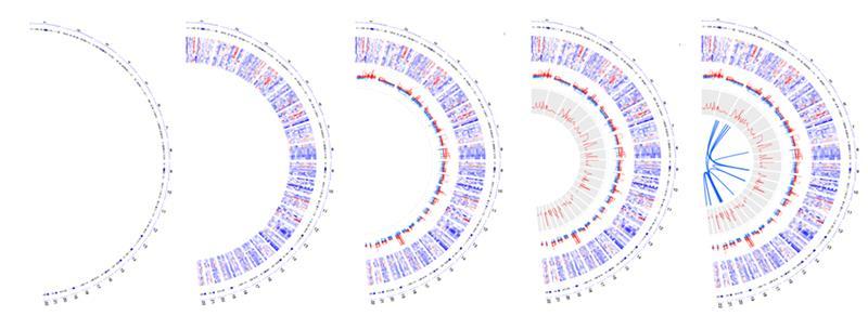
Figure 1A.
Here is an example of how these tracks look when shown in a circular format.
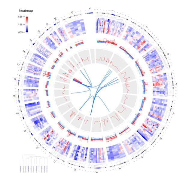
Figure 1B.
Figure 2 shows how you can use OmicCircos to visualize the links between the human papillomavirus (HPV) genome and human genes. Experts recognize HPV infection as the cause of cervical cancer, as well as other cancers.
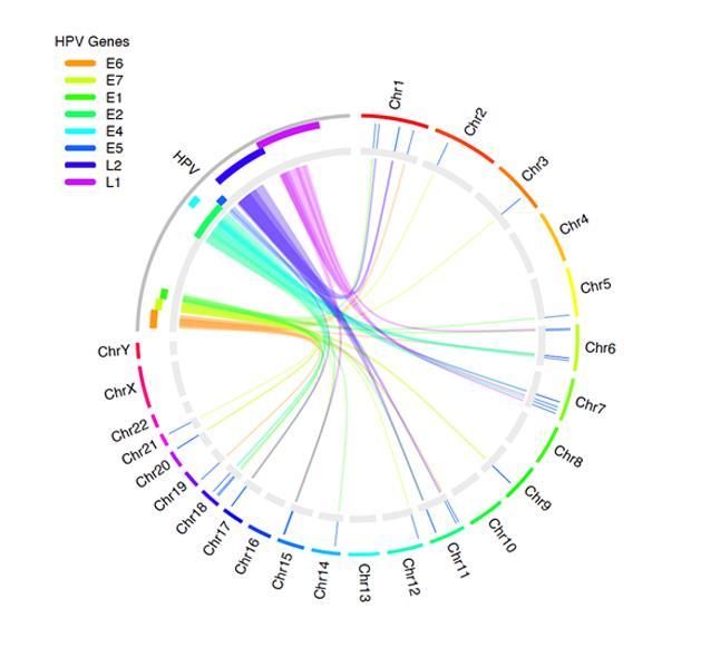
Figure 2.
How Have Researchers Used OmicCircos?
Cancer researchers have primarily used OmicCircos to create chromosome-based circular visualizations of multi-omics data, especially for:
- integrating CNV, mutation, methylation, and gene-expression data.
- summarizing cancer genomes across chromosomes.
- showing structural variation, translocations, and fusion-like links.
- comparing multiple samples or cohorts in one genome-wide figure.
- displaying layered omics tracks in a single compact plot.
Check out PubMed for a list of publications citing how researchers have used OmicCircos.
Want to Try OmicCircos?
Ready to try OmicCircos? Figure 3 shows a sample visualization. You can find the code for creating the graphic in the callout box below.
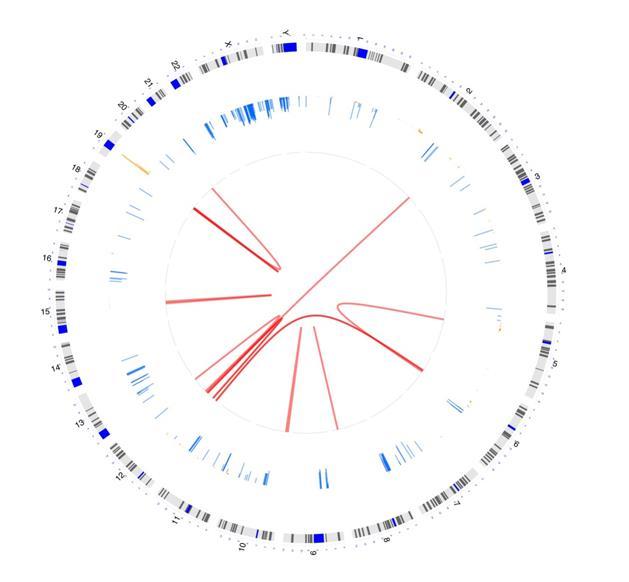
Figure 3.
A GitHub page has detailed information on accessing OmicCircos, along with additional samples and code you’ll need for creating these images.